Sales page teardown: Snappy
Let’s try something a little different. I’ve always loved picking apart great sales pages to see what makes them tick.
Snappy is a customer support webapp which targets small to medium-sized companies. They have a great sales page which uses customer quotes really well.
Introduction
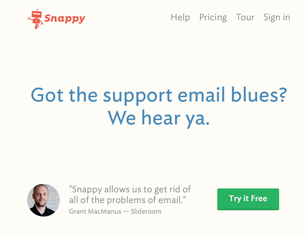
This is the first thing you see about snappy. The design is quite minimalist, but there are links to all the important pages, including my favorite one, the login page.1
The tagline is clear and direct. It’s a good idea to have a customer testimonial from the get-go — it’s always reassuring to see an app is used by real persons. However, the quote itself is a little too non-specific for my taste:
“Snappy allows us to get rid of all of the problems of email”.
Sure, email has a lot of problems, but does Snappy solve mine? The role of the first screen is to make the reader read the rest of the page. Opening with a quote about a very specific problem of email support (e.g: the number of dropped support emails before and after snappy) would make the copy much more compelling.2
Story
The next screen shows a small screenshot of Snappy followed by four paragraphs of sales text. It’s a very good idea to tease us with this image before getting to the wall of text.
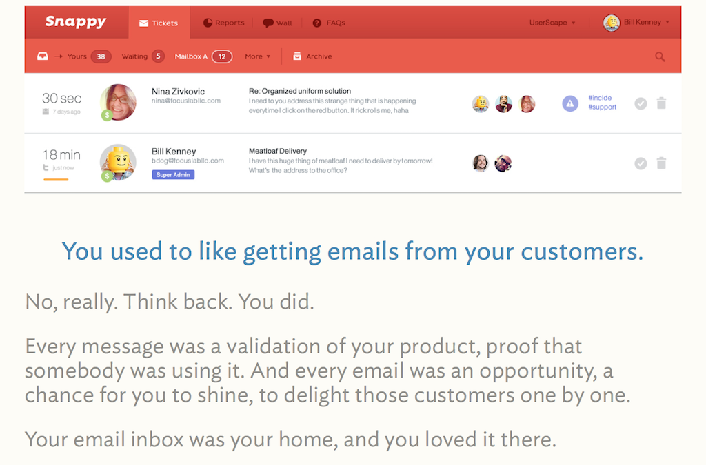
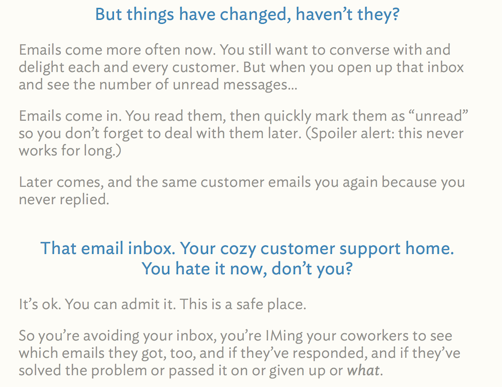
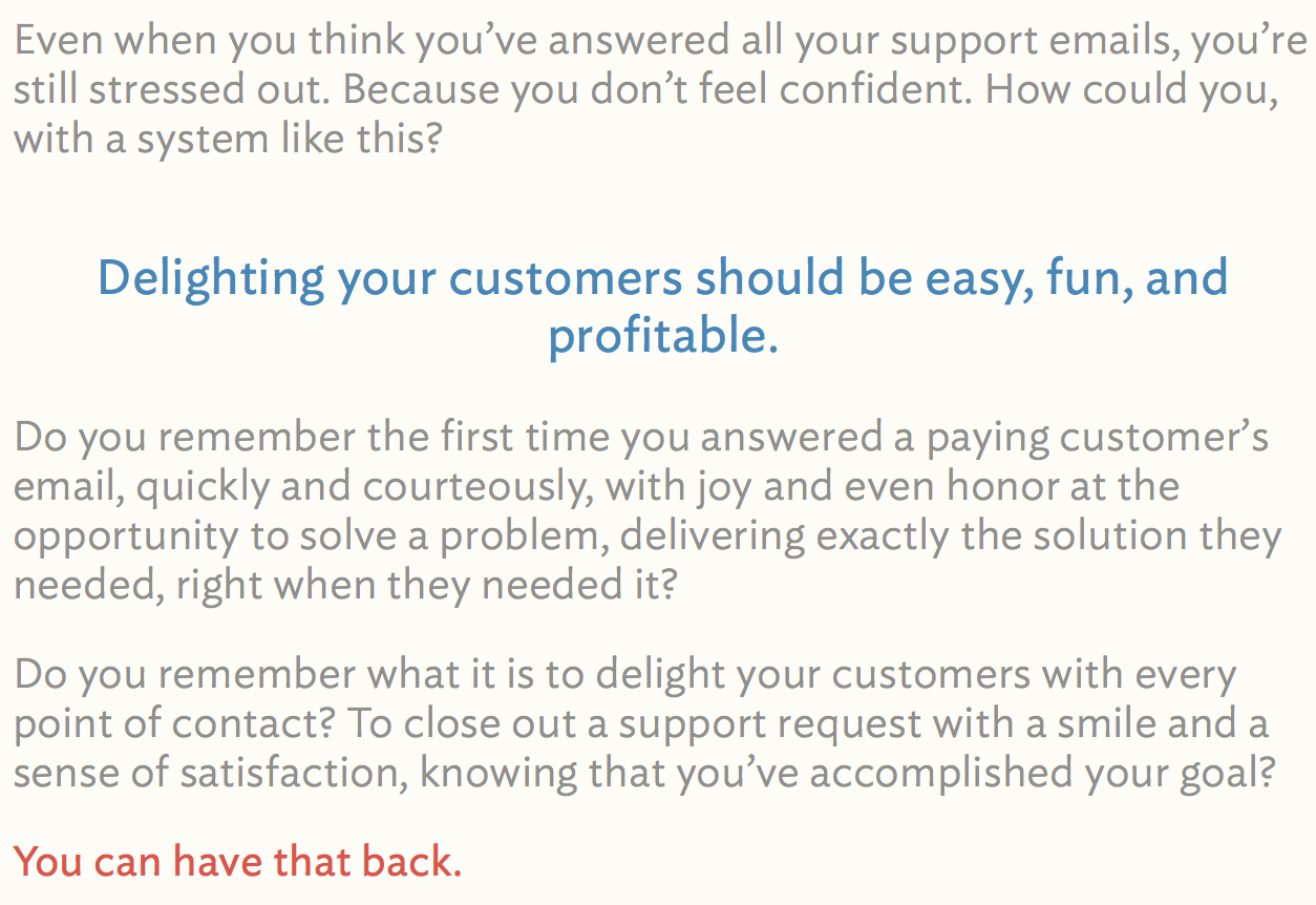
The role of this part is to make the reader realize she has a support email problem. It tells a story, which is the most important thing in sales page. The story itself is good3 — and the outline is very clear (which is great for skimmers!). However, there’s a couple things which could be better.
First, some sentences are way too long. “Do you remember the first time you answered a paying customer’s email, quickly and courteously, with joy and even honor at the opportunity to solve a problem, delivering exactly the solution they needed, right when they needed it?”
Long and meandering sentences like this one run out of steam quickly. Shorter phrases are easier to grasp, and pack more punch. (In this case, I would rewrite the previous sentence like this: “Do you remember the first time you answered a customer’s email? How quickly you replied — the joy you felt about solving their problem? Do you remember how thrilled they were to see their problem solved?”)
Second, and this is very subjective, but the parts could flow a little better. In particular, I feel like part two and three could be merged together. They’re about the same thing after all.
Still, these are minor complaints which could get smoothed out with a little editing.
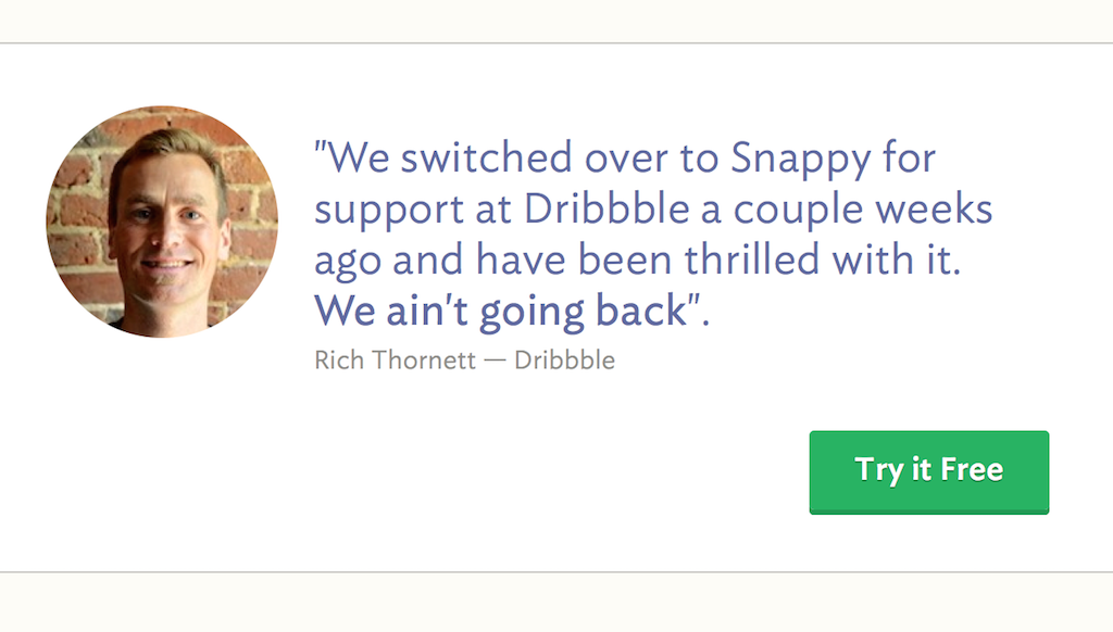
The next part is brillant! Most sales pages would jump straight to the presentation of the product. The snappy guys chose to feature a great customer quote. “We ain’t going back”. This is gold!
Benefits
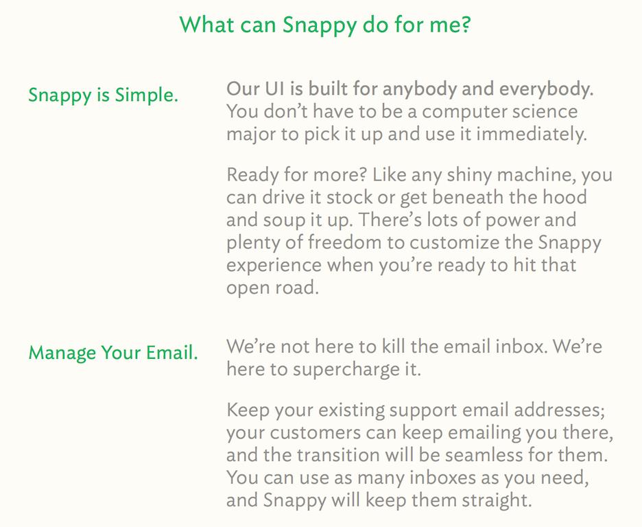
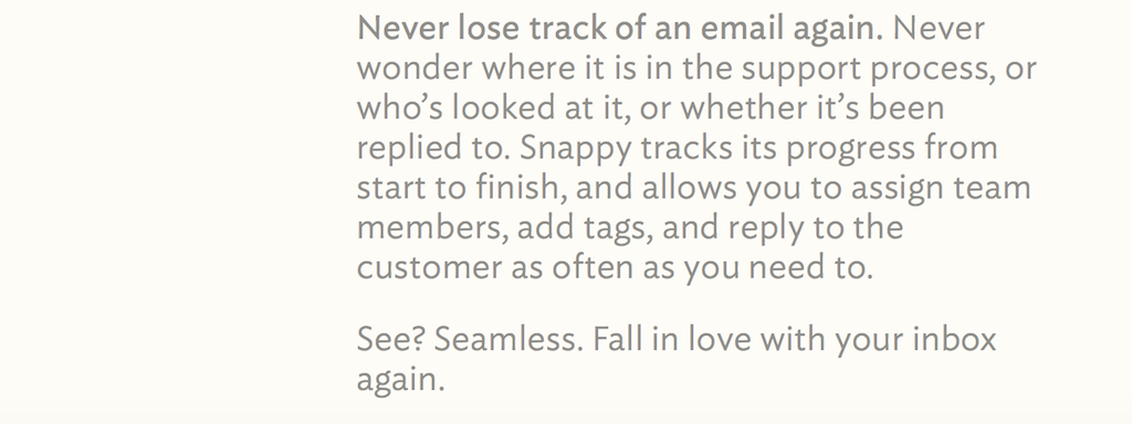
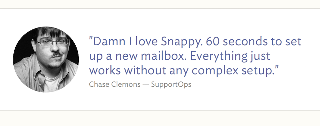
We get to the meat of the sales pitch with the long list of benefits Snappy brings. This is pretty much your standard list of benefits. Once again, I really like how the designers peppered customer testimonials to break the monotony.
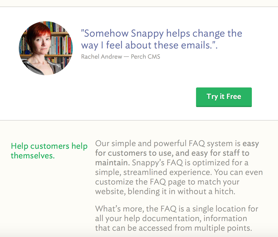
Unfortunately they didn’t follow their idea all the way through: they’ve got a great quote about how easy it is to set up Snappy, but it floats at the bottom of the page instead of supporting the main pitch:
Pricing grid
The next section is the pricing grid. I really like how their design reminds the reader of the hidden costs of using Gmail for support. It’s a great way to make choosing Snappy obvious.
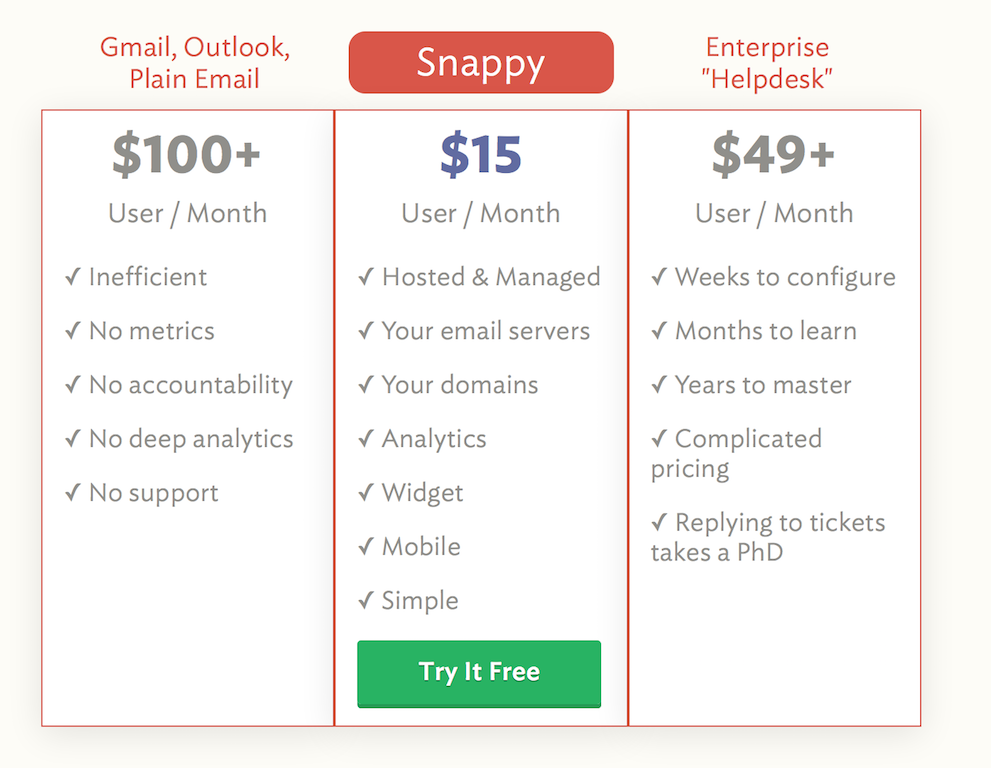
One weird thing with this pricing model is that they’re charging the same flat-rate per seat whatever the number of users. Surely the usefulness of Snappy increases with the number of support persons, which implies higher prices?4
Wrap-up
The page wraps things up quickly by presenting the team5, showing one last testimonial and suggesting taking the product tour.
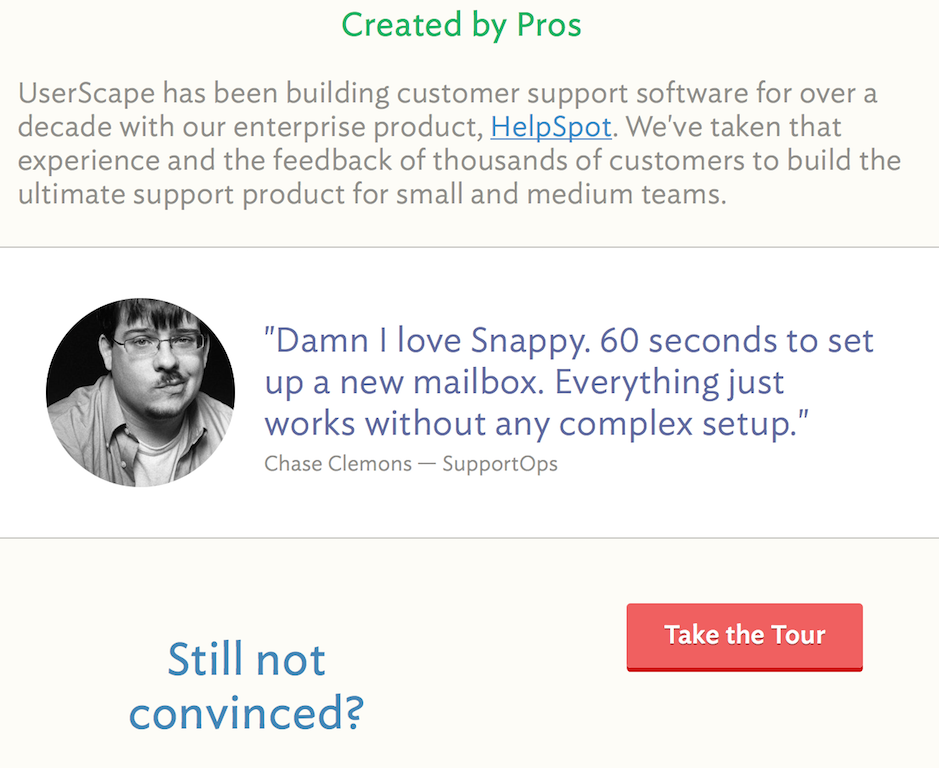
It would be awesome to have a link to talk to support directly — this a helpdesk solution after all. I looked at a few other helpdesk webapps6 and none of them displayed a prominent link to contact support. Either they all forgot about it or there’s a specific reason — maybe spending too much time on unqualified leads?
Conclusion
All in all, this is a great sales page! It has a couple minor problems, but nothing that couldn’t be improved with some patient testing.
Key takeaway: Customer testimonials are great. Use them to support your pitch.
-
You’d be surprised by the number of webapps that forget this. ↩
-
Of course, they’ve probably A/B tested a bunch of quotes and this one came out ahead, but still. ↩
-
Especially the bit about marking emails as unread. I do this all the time! ↩
-
This also applies to using Gmail or Outlook. The hidden cost of using Outlook for a single user is probably 100$/month but it increases significantly (read: non-linearly) with the number of users. ↩
-
It would be nice to have a link to a brief “About us/History of the company” page. It’s important for the reader to know that this is not a fly-by-night operation. For example, 37signals/Basecamp has an awesome about page which presents the company while resolving tons of customer objections. Litterally every paragraph deals with a separate concern a client may have. ↩