Mapping Needles in San Francisco
My biggest shock when moving to San Francisco was seeing the heartbreaking number of people living in the streets. I have the feeling that in the last few years, things have been getting worse. There are more people on the street, more tent campments and more drug use.
I just learnt through this very cool article about the city of San Francisco’s open data initiative, so I decided to check if my perception was true or not.
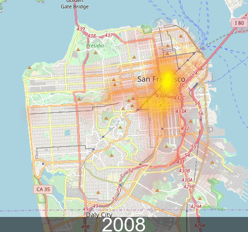
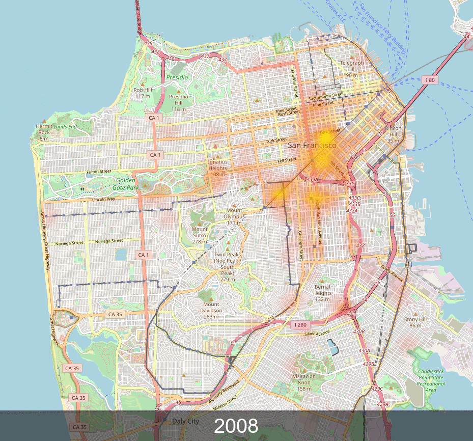
I won’t bore you with technical details1, but it wasn’t too hard to plot on a map all the places where people reported needles. Here’s an animated GIF over the years:
There is one caveat to this graph though: it seems that most of the GPS data comes from the SF 311 app, where people can report streetcleaning issues. It’s very likely that we’re only plotting partial data between 2008 and 2011.
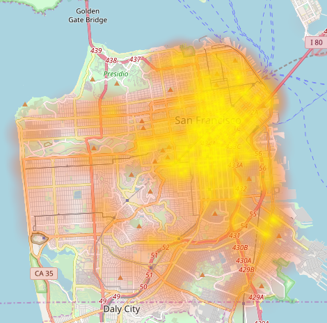
And if you’re curious, here’s a complete map of where people have found needles in the city. Sounds like you should move to the Presidio if you want to avoid them.
-
It was pretty simple to make these maps. I just had to download the data from the city’s website. They provide it in CSV which made it super easy to parse it with a Python script.
After that, I used heatmap to plot the data on a map and ImageMagick to generate an animated GIF from it. Check out the github repo if you’re curious about the exact incantations I used. ↩