Price anchoring
I recently discovered the practice of price anchoring, which is based on a cognitive bias we all have called… anchoring.
Put simply, when presented with choices, our brains have a natural tendency to take a decision based on the first choice we’ve seen.
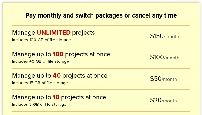
Anchoring is why for instance 37signals chose this design:

Over this older one:

On the older design, the eye is attracted to the “Plus Plan”, skipping entirely the others.
I suppose that at the time they thought they needed to upsell their users to the “Plus Plan” but then realized they may as well try to sell the others, more expensive plans.
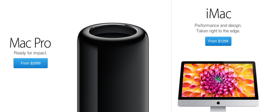
Another interesting example is Apple’s web store:

It really interesting to see how the page design guides the eye. The Mac Pro takes most of the space of the page, even though Apple probably sells more iMacs than Mac Pros. Why then emphasize the Mac Pro other the more popular choice?
The reasoning here is probably that the people who want to get a Mac Pro, will get a Mac Pro. However, there’s probably a large number of potential buyers who are on the fence between a mac and PC. To those buyers, the Mac Pro anchors signals that the iMac is pretty reasonable choice.
Of course, anchoring is nothing revolutionary - it has been used for years - but it’s always interesting to see how the concept is used in the real world.